
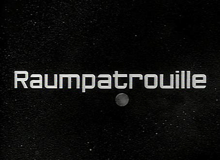
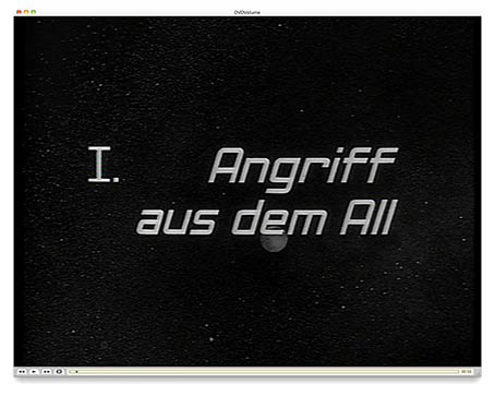
I still think this is a rather modern looking typeface, even by today’s standards. It’s slightly reminiscent of the wide-running Eurostile typeface, but it’s certainly not any known font. Hand-drawn, perhaps?
According to Josef Hilger, long-time fan and curator of the Raumpatrouille Museum, the titles were indeed drawn by hand. In the mid-sixties, this was probably done with a ruling pen on thick cardboard, then filled in with a brush.
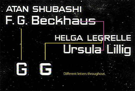
Looking through the titles it became clear that the typeface is based loosely on a 5×5 square matrix. At least that’s what it should be based on. But the person who created the type cheated. A lot.
Look at the Raumpatrouille title screen pictured above. It’s much bolder than this title:
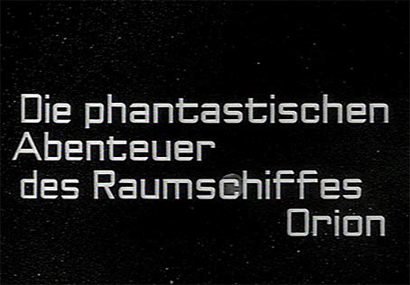
Then, even within the same titles, we have a slightly condensed version together with a “normal” version of the typeface.
These are the problems when trying to recreate this particular typeface on the Mac or on any other computer, which of course is a very silly thing to do in the first place. Why would anyone do this?
Because it’s possible, that’s why. And because this has been bugging me since I first owned an Atari Mega 1, which is really long ago. Very long ago, to be precise.
Another version of the typeface surfaced many years ago, probably on Compuserve, which was created by someone unknown and was called »Star Patrol«.
Compuserve“Star Patrol”:
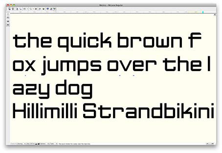
Not bad for a start, but as you can see it looks pretty horrible with all the various line weights and the non-existent kerning.
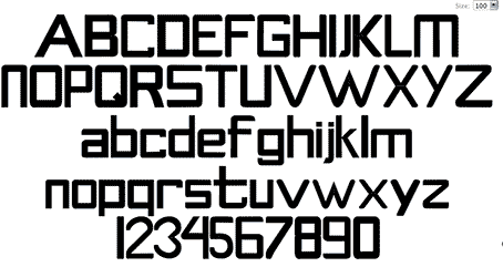
After a discussion in the Frog Mailing List, I decided to give it a go myself. Anyone who wants to recreate the ‘Raumpatrouille Font’ is faced with the above problems — which version to go with? Also, there are a few characters missing in the titles. For example, I couldn’t find an “x” anywhere, so I had to make it up, along with other ‘missing’ characters. Since there are so many different versions of the various letters in the original, I opted for the square version: a 5×5 matrix for the x-height.
I had to compromise. And I cheated too. Graphic designers always cheat.
I started off in fontstruct (which is great, but also rather limited) for the basic letter shapes, then downloaded the font to open it up again in FontLab.
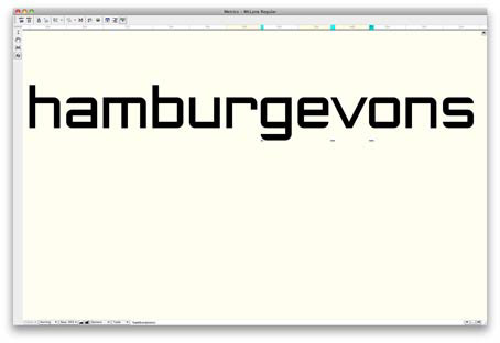
Adjusting the kerning of pairs
And now it’s all done and from my point of view the best Raumpatrouille font you can get for your computer. And that’s simply because there is no other one. Enjoy.
The typeface is called McLane and you can download it here.
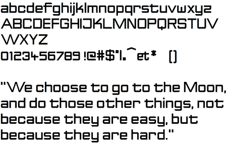
I designed it as an Open Type .ttf and it’s got got the basic Latin and some extended Latin, published under Creative Commons License 3.0, which means you can do whatever you like with the typeface; extend it, change it, or even mess it up completely. I don’t care.
Final copyright is probably still with Bavaria Film.
Enjoy; grab the font and improve it. And if there are any problems, I really don’t want to know. And don’t get me started on the italics:
Originally published in October 2009 in my old blog, "The Cartoonist".
Copyright © Ralf Zeigermann 2019